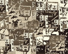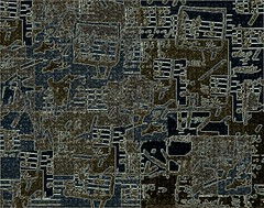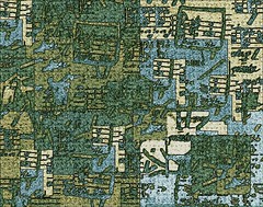
Some kind of music collage multimedia thing.

The same thing after extensive Photoshoppery monkeyshines.
Printed at 8 and a half by 11 inches with a cheap HP inkjet on matte brochure paper, and displayed in frameless glass picture mounts from the local dollar store, they look rather attractive but a bit small and lost. It's a start, though. My co-workers have very kindly hidden their confusion and made only polite noises so far (at least in my presence).
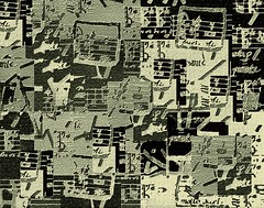
I've since added these two, which the discerning of eye will realize are simply slightly processed negatives of the others:


Actually, I reduced the contrast on the last one and applied a bit of warming filter, to make it a bit less stark black and white than what's shown here, but you get the idea, I think.
All of these were derived from this awful piece of, and I use the term loosely, multimedia art, which I made in late 1987 or possibly early 1988:

Paper, markers, crayon, paint and glue.
Next up: photographs. Of birds' nests, rocks, fence rails, flowers, and the like. You've been warned.
Note 1: not.
Note 2: not.
6 comments:
Hey, don't blame me!
:)
Well, I like them. And I think copies of your photos will look fab.
Well, thank you. I put them in a 2 x 2 arrangement, with the positive and negative versions of each in opposite corners (if you see what I mean).
I'm still struggling a bit with which photos to choose. Maybe I'll have a blog poll of the short list. Which, given historical data, will result in about three responses in total (one of which will be "none of the above", doubtless).
Actually, I like the green one the best. Would you post a photo of them arranged on the wall?
Debi - will attempt to do so (problem being remembering to bring camera to work).
I'm partial to the dark bluey-brown one myself ("music_art_quilt" if you hover your mouse over the thumbnails).
While I prefer the lost manuscript one.
It's going to be an inconclusive poll, isn't it?
Post a Comment